
BUDWEISER
RETRO
REIMAGINED
As a brand, Budweiser has over 100 years of history.
And in an age dominated by impersonal digital connections, we wanted to leverage nostalgia as a tool to effectively generate feelings of positivity and comfort amongst consumers.
We cashed in on Budweiser’s rich history by reviving their vintage print ads — emulating that same painterly aesthetic, while modernizing the subject matter. In order to pull this off successfully, there were two sensitive topics we needed to address head-on.

Diversity & Inclusion
The retro Budweiser ads serving as our inspiration (above) needed a serious refresh in regards to inclusivity and context in order to be an accurate and appropriate representation of modern society.
There’s a severe lack of diversity in the original ads that we wanted to correct by featuring BIPOC in our campaign.
We also sought to eliminate the offensive gender stereotypes displayed in the retro ads and replaced them with depictions that were more balanced and empowering.

COVID-19
We developed this campaign during the onset of a global pandemic and were forced to consider how this would affect consumer behavior.
With mass bar closings happening nationwide, on-premise sales of alcohol began plummeting. This left us to focus our efforts on sales taking place off-premise (beginning with a series of quick-turn social posts).
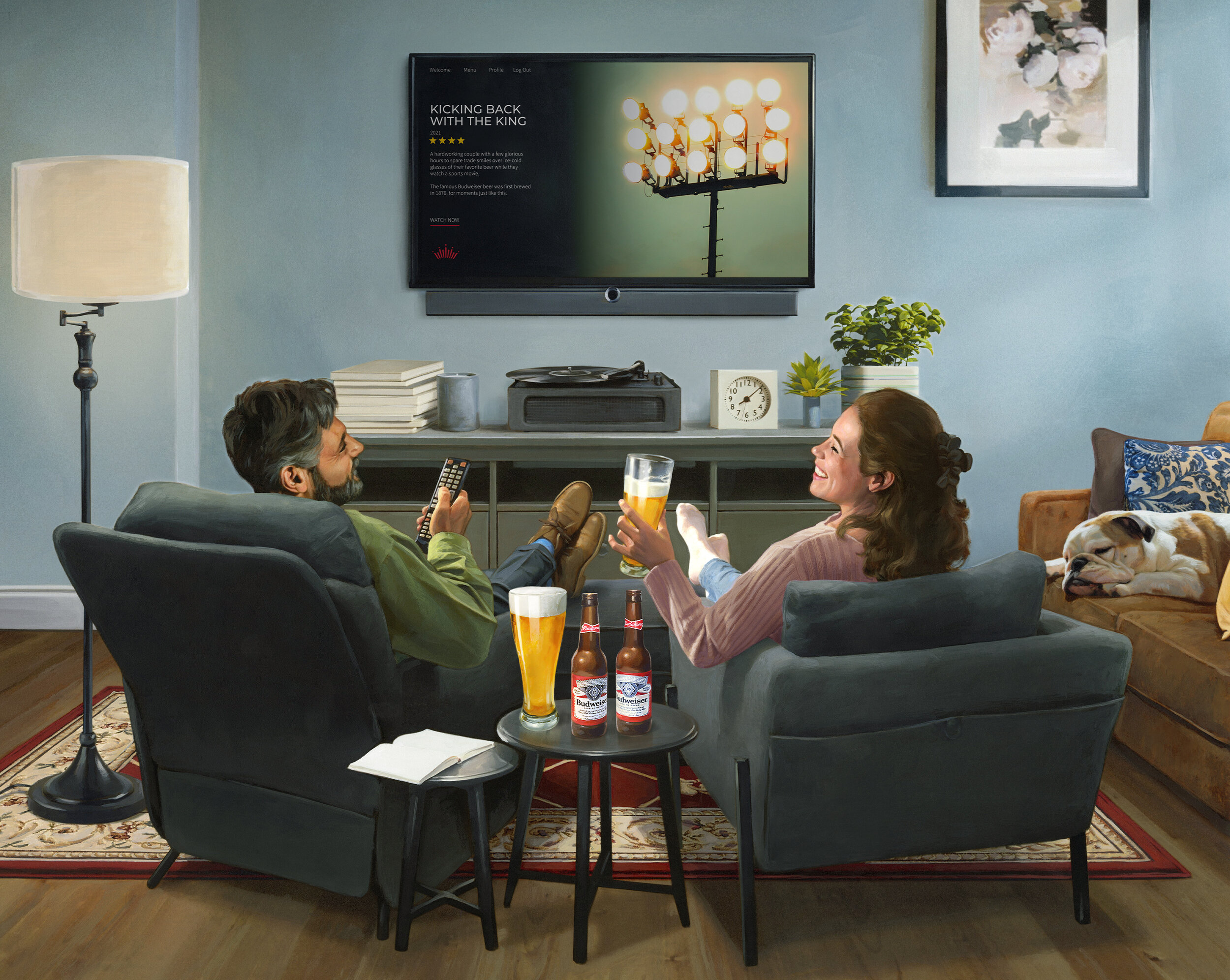
People started stocking up – purchasing in greater quantity and making fewer trips to the store. At-home consumption and the desire to relax were reaching an all-time high.

As a team, we identified four relaxed at-home drinking occasions that I created concept sketches of. Once we received client alignment on these roughs, we commissioned illustrator Michael Koelsch (known for mastering the retro era 50's and 60's style in his work) to help bring our vision to life.
Our collaboration with Michael allowed us the ability to refine styling details, adjust facial expressions and body language of our subjects, and address client feedback we acquired along the way – until ultimately we landed on final illustrations that we all felt good about.


Make it a Double
The first four illustrations were so well-received that our clients gave us the green light to create an additional one – this time reviving Bud’s retro “Pick A Pair” promotion.


CREDITS
Agency: FCB
Group Creative Director: Tony Mavrelis
Sr. Art Director: Robert Navarro
Sr. Copywriter: Rene Otero
Illustrator: Michael Koelsch